Feedback
Visualize data with Grafana
Grafana is an open-source tool that helps you build real-time dashboards, graphs, and all sorts of data visualizations. It is the perfect complement to CrateDB, which is purpose-built for monitoring large volumes of machine data in real-time.
For the purposes of this guide, it is assumed that you have a cluster up and running and can access the Console. If not, please refer to the tutorial on how to deploy a cluster for the first time.
Table of contents
Load a sample dataset
To visualize data with Grafana, a dataset is needed first. In this sample, demo data is added directly via the CrateDB Cloud Console. To import the data go to the Overview page of your deployed cluster.
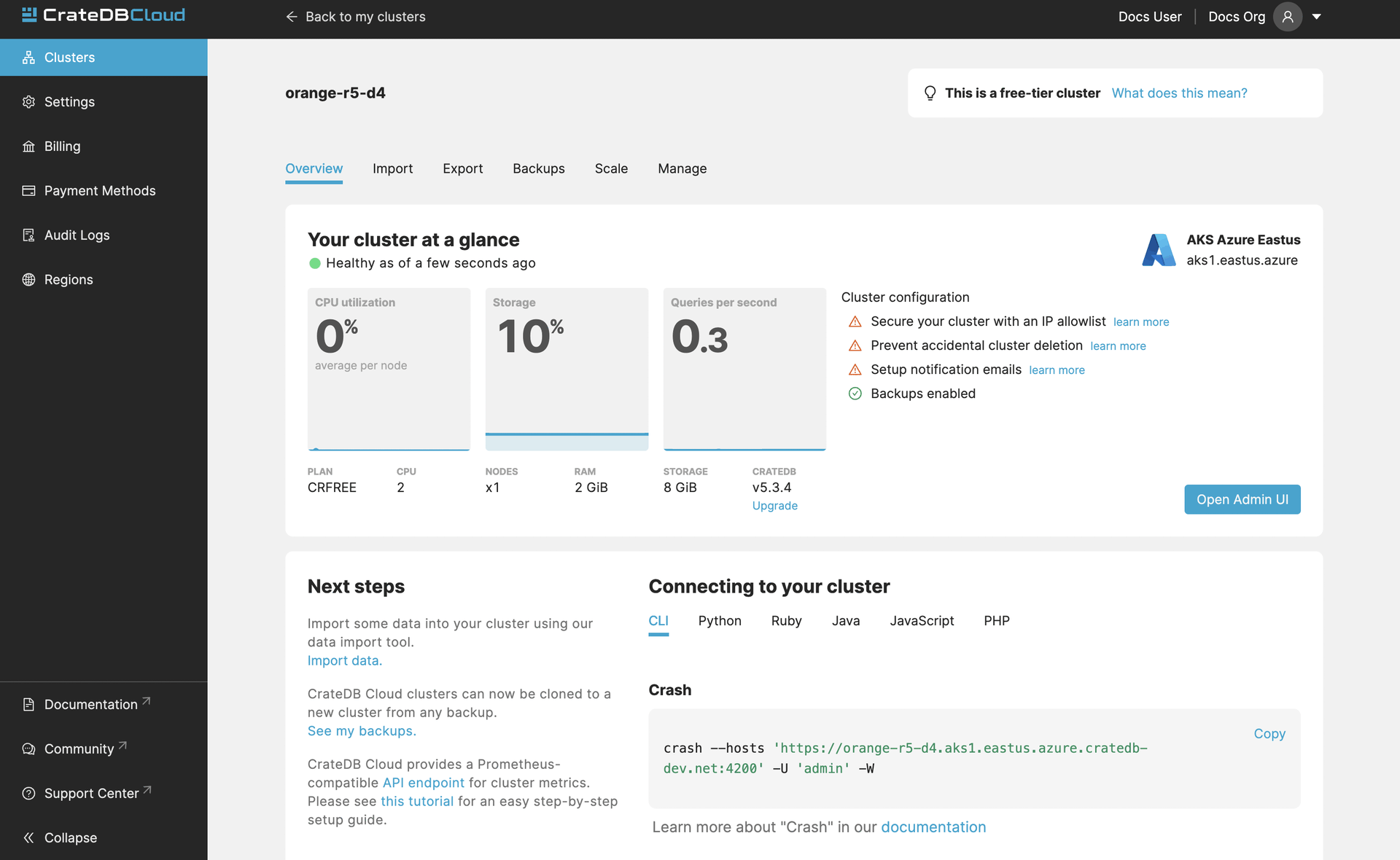
Once on the Overview page, click on the import the demo data link in the “Next steps” section of the Console. A window with 2 SQL statements will appear. The first of them creates a table that will host the data from NYC Taxi & Limousine Commission which is used in this example. The second statement imports the data into the table created in the first step. These statements must be executed in the shown order. First “1. Create the table” and then “2. Import the data”.
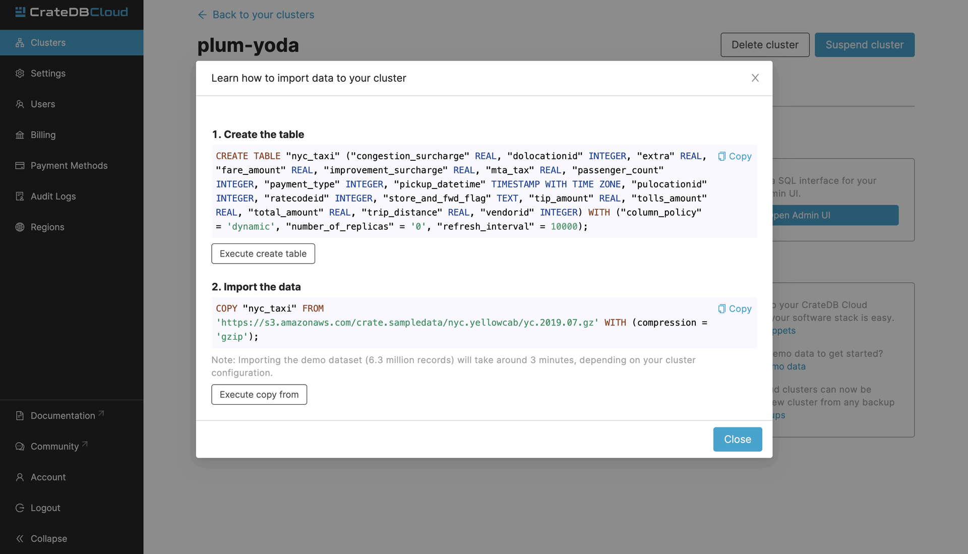
When you click on either of the Execute buttons, you will be brought to the CrateDB Admin UI which is the admin UI of your cluster. When accessing it for the first time, you will need the username and password that you set when you deployed the cluster.
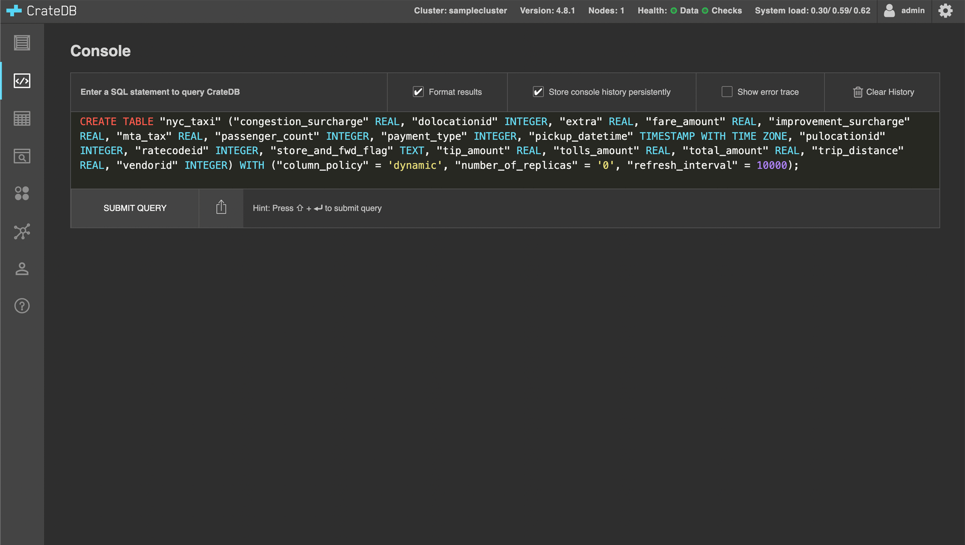
After executing the second SQL statement, the “nyc_taxi” table will be populated with data. Depending on your cluster configuration this can take around 40 minutes.
Install Grafana
To install Grafana locally, refer to the Grafana documentation. In this guide, local installation is used but you can also use Grafana cloud deployment.
Connect Grafana to CrateDB Cloud
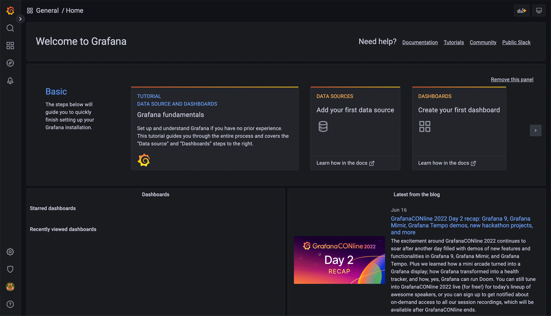
After setting up and logging into Grafana, you should be greeted by Grafana Home page.
To visualize the data, you must add a data source. To do this, click on the cogwheel “Settings” icon in the left menu bar. This should take you to the Data sources Configuration page.
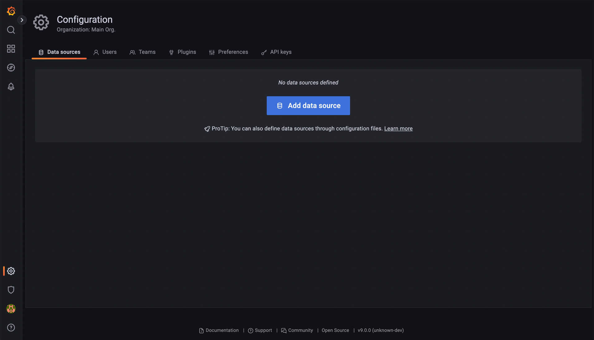
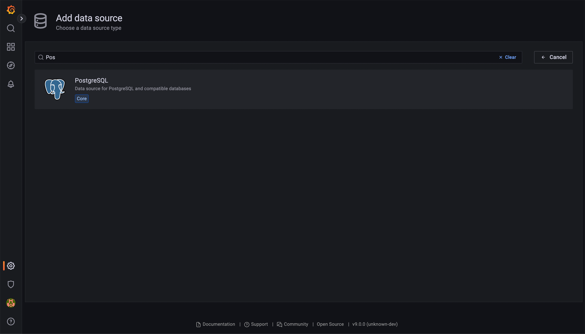
Once there, click on the Add data source button. Here, look up and choose “PostgreSQL”.
Once “PostgreSQL” is chosen, you will be brought to a form that you must fill out to connect to the CrateDB Cloud. A completed example might look like the screenshot below.
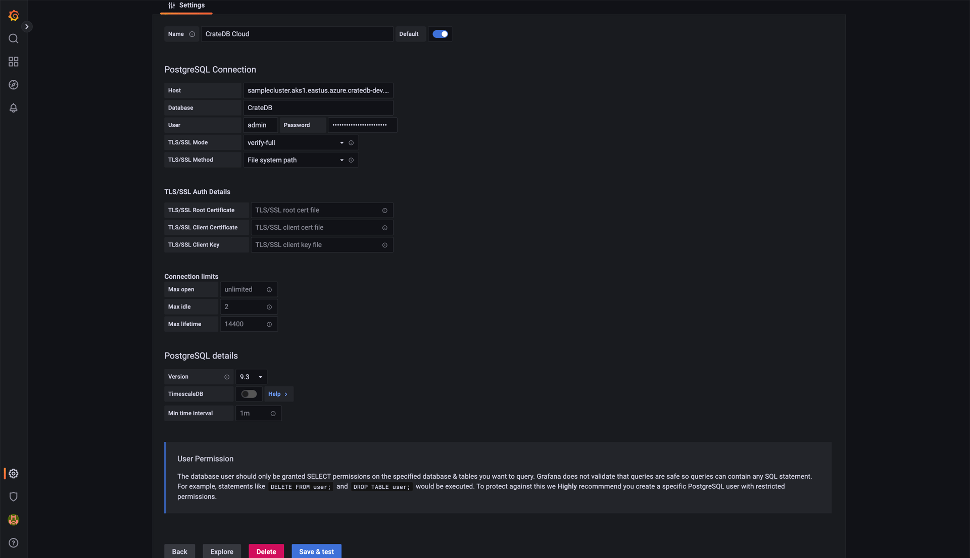
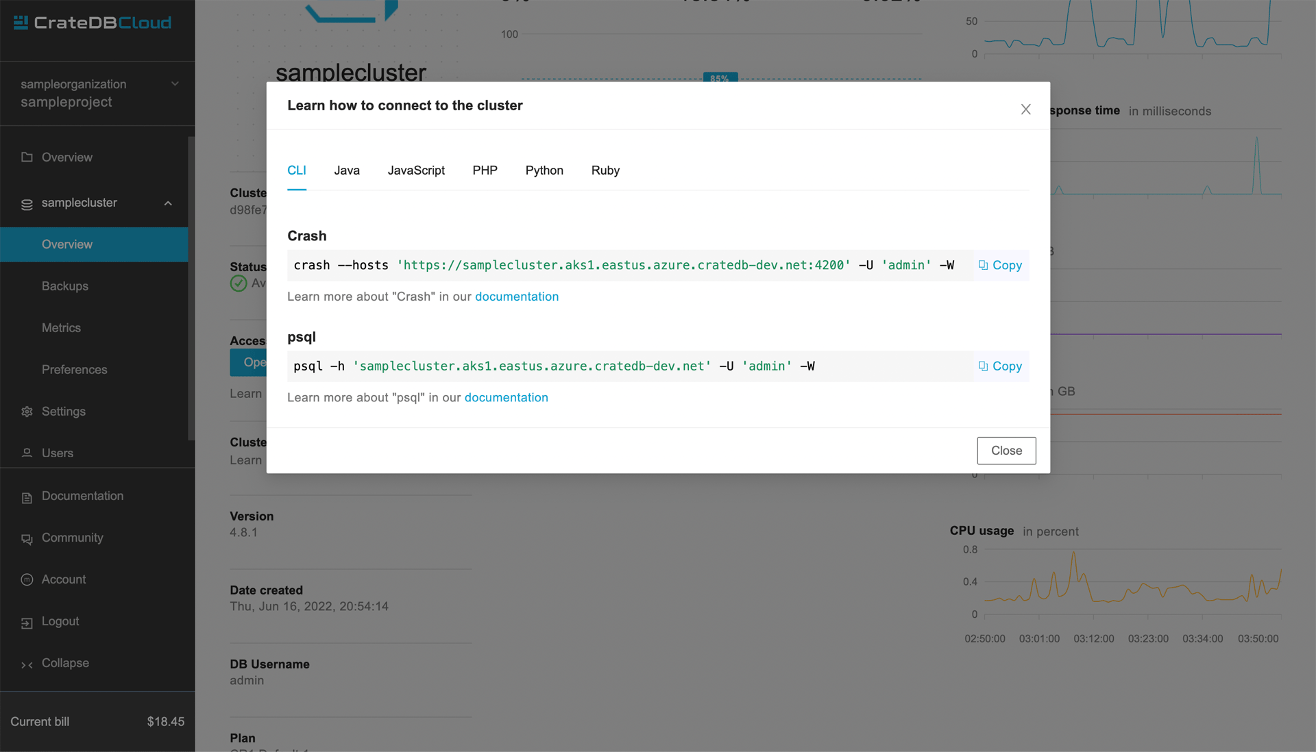
The host and user credentials may appear differently to you. The host can be found on the Overview page of your cluster on CrateDB Cloud under the Learn how to connect to the cluster link. You will want to use the psql link. Depending on the region where your cluster is deployed it might look something like:
samplecluster.aks1.eastus.azure.cratedb-dev.net
After submitting all that to the Grafana connection form, it should return “Database Connection OK”. Then, the connection is established and you can move on to creating some dashboards.
Build your first Grafana dashboard
Now that you’ve got the data imported to CrateDB Cloud and Grafana connected to it, it’s time to visualize that data. In Grafana this is done using Dashboards. To create a new dashboard click on the Create your first dashboard on the Grafana homepage. You will be greeted by a dashboard creation page.
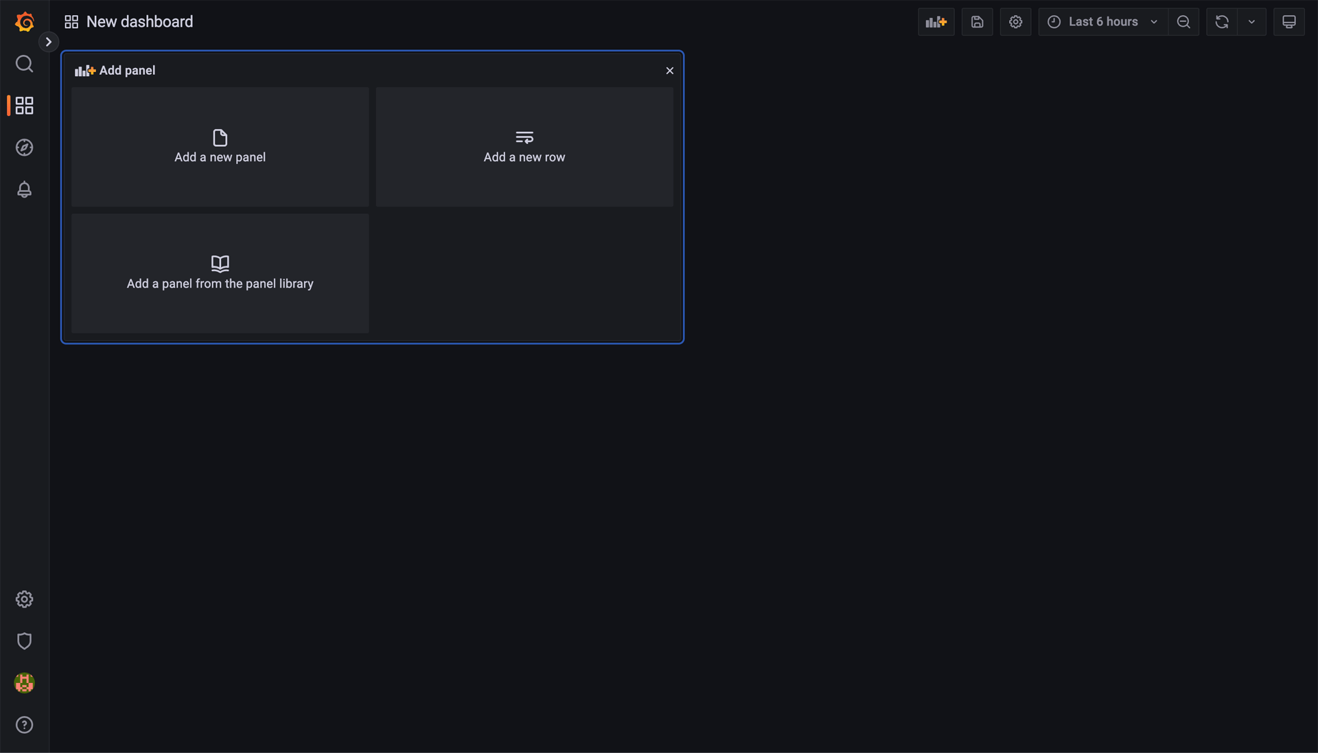
In Grafana, dashboards are composed of individual blocks called panels, to which you can assign different visualization types and individual queries. First, click on Add new panel.
That will bring you to the panel creation page. Here you define the query for your panel, the type of visualization (like graphs, stats, tables, or bar charts), and the time range. Grafana offers a lot of options for data visualization, so this guide will showcase two simple use-cases. It is recommended to look into the documentation on Grafana panels.
To create a panel, you start by defining the query. To do that click on the Edit SQL button.
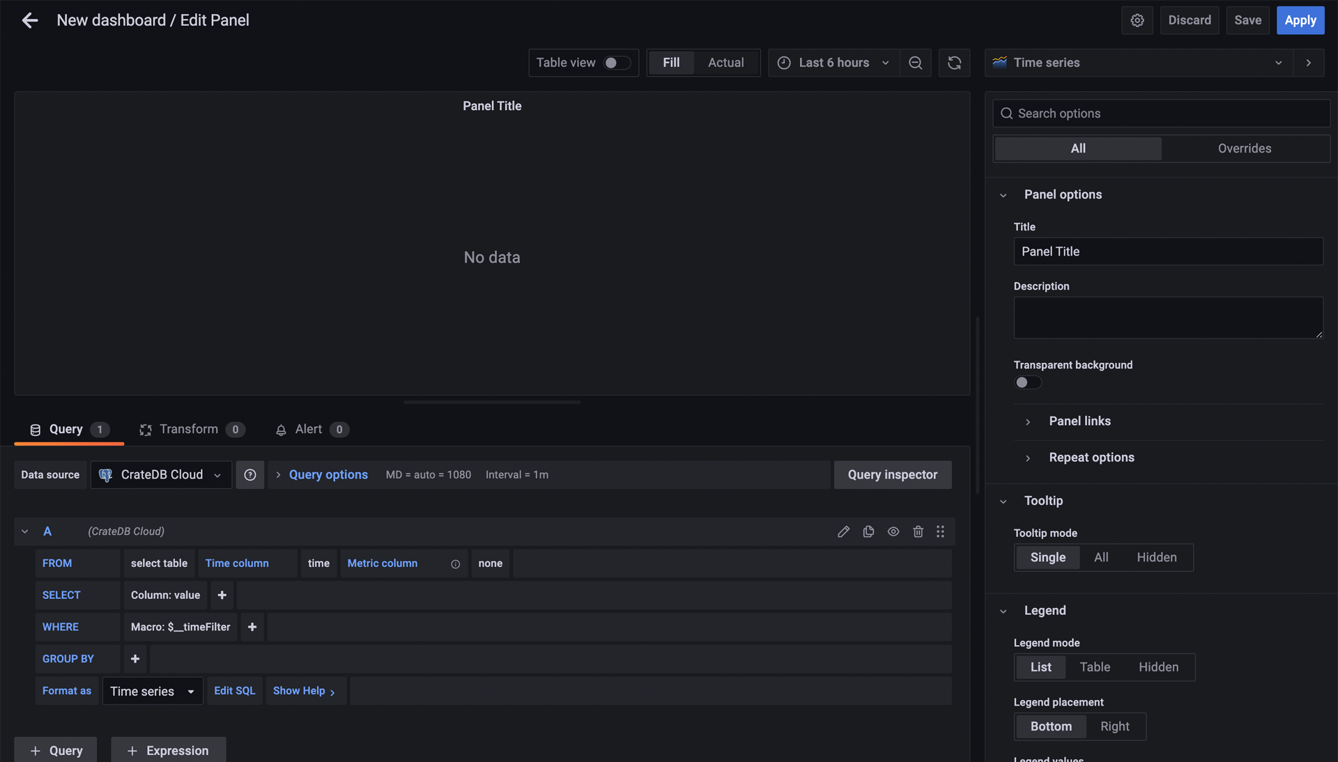
A console into which you write the SQL statements will appear. This panel will plot the number of rides per day in the first week of July 2019:
SELECT date_trunc('day', pickup_datetime) AS time,
COUNT(*) AS rides
FROM nyc_taxi
WHERE pickup_datetime BETWEEN '2019-07-01T00:00:00' AND '2019-07-07T23:59:59'
GROUP BY 1
ORDER BY 1;
Note
Something important to know about the “Time series” format mode in Grafana is that your query needs to return a column called “time”. Grafana will identify this as your time metric, so make sure the column has the proper datatype (any datatype representing an epoch time). In this query, we’re labeling pickup_datetime as “time” for this reason.
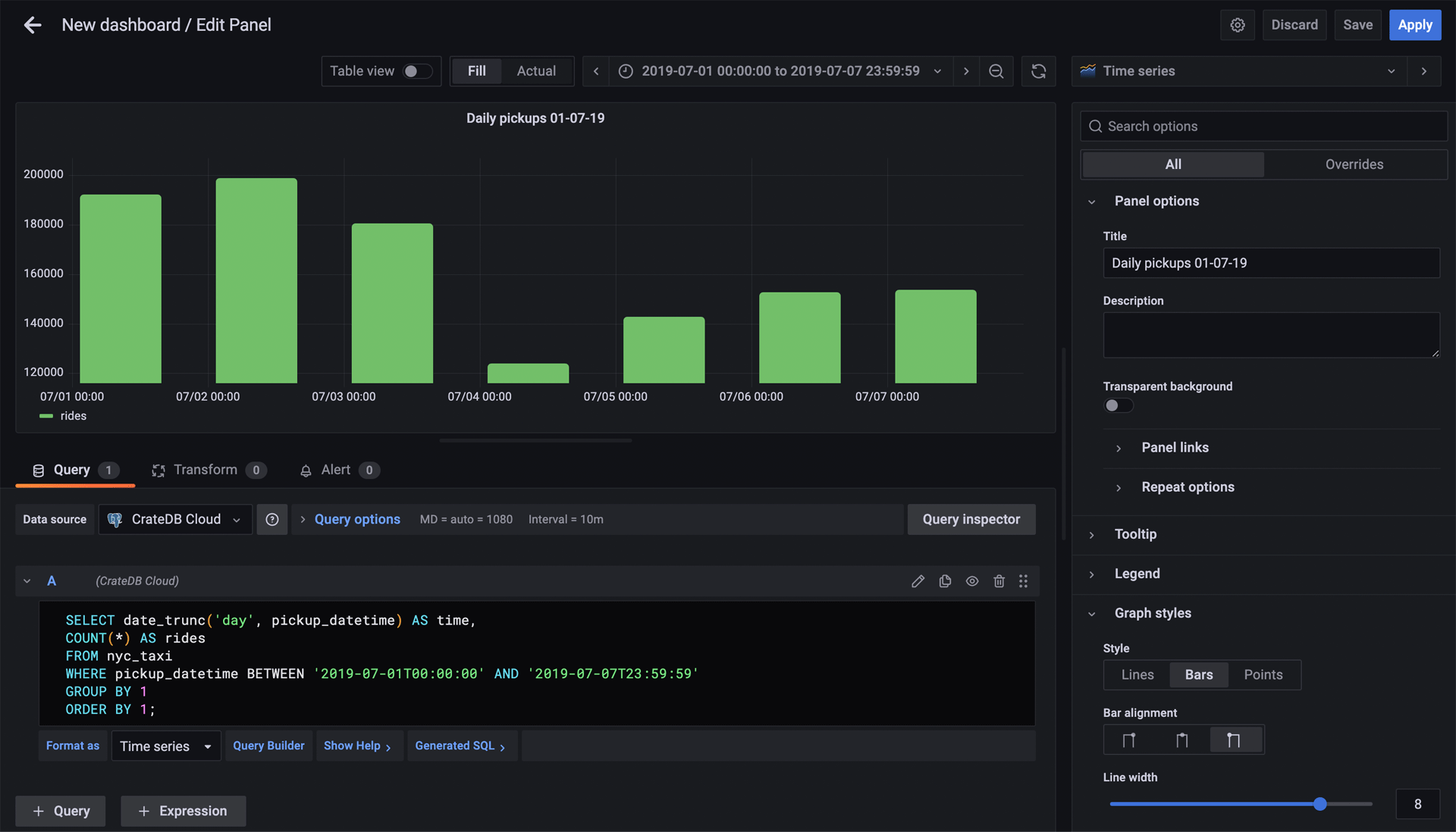
Once you input these SQL statements, there are a couple of adjustments you can make:
On the top of the panel, select the appropriate time range for your panel—in this case, from July 1st to July 7th, 2019:
Under “Settings” on the right, define the name of your panel.
Under “Display”, select “Bars”.
After that, you should get a panel similar to this:
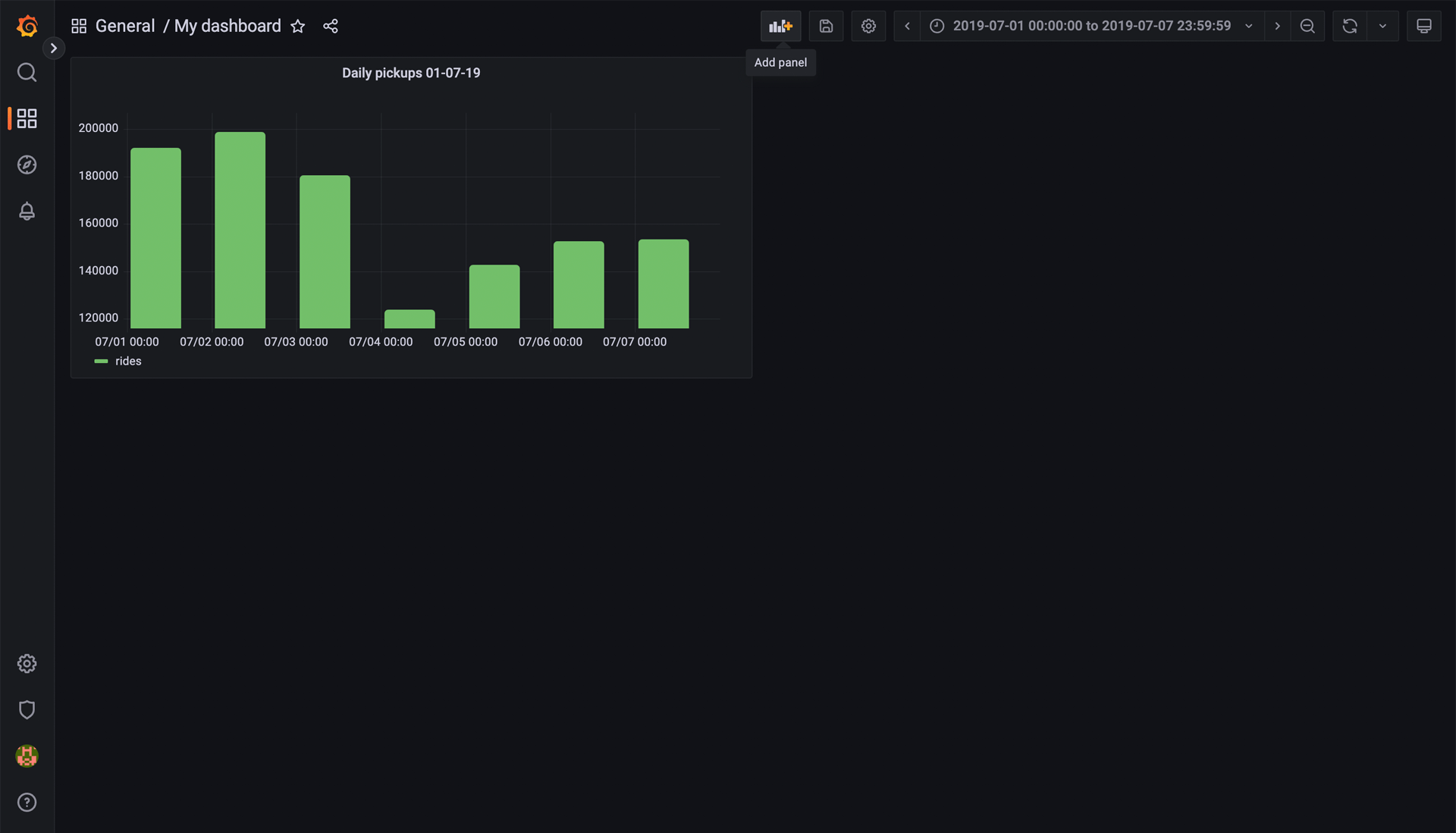
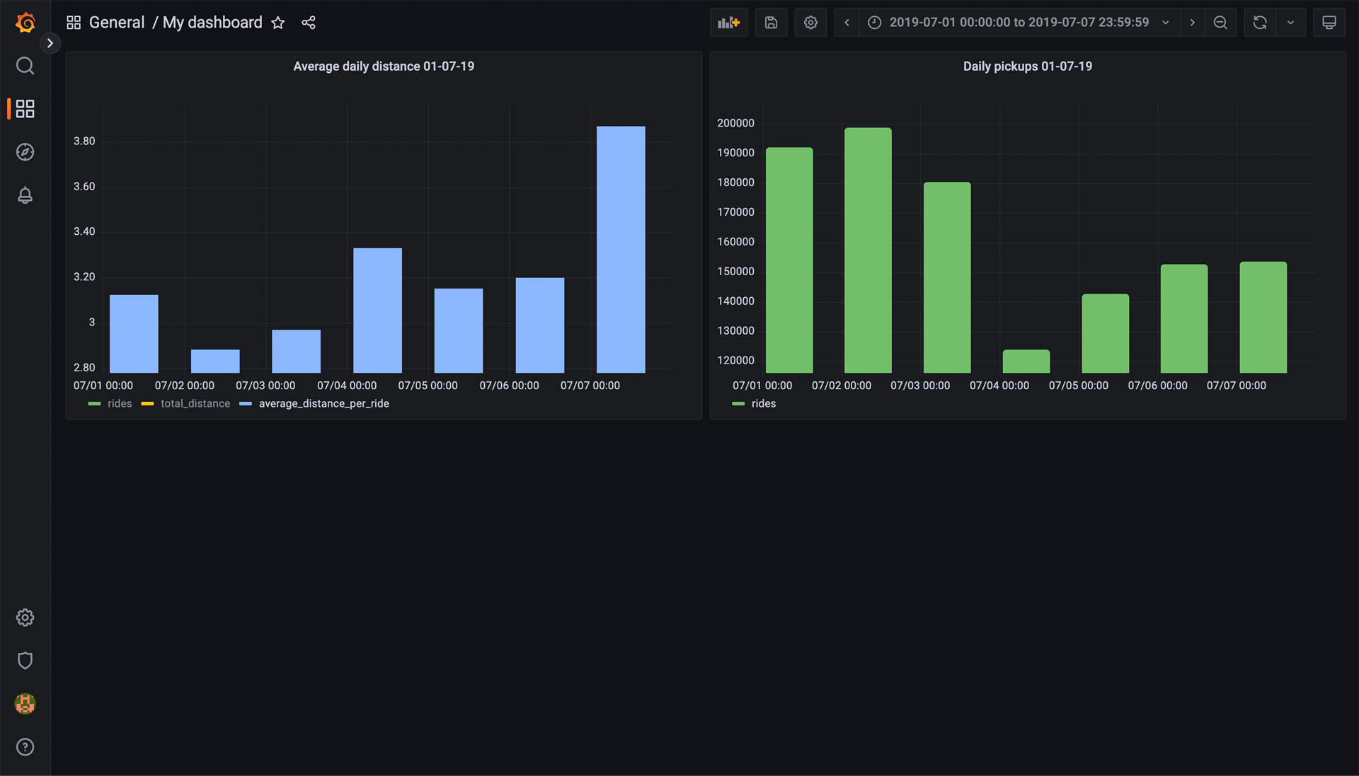
When you’re satisfied with the look of the panel, click Apply. This will bring you back to the overview of the dashboard. Now it will have 1 panel created in it. Click on the Add panel in the top menu bar and you can create another one.
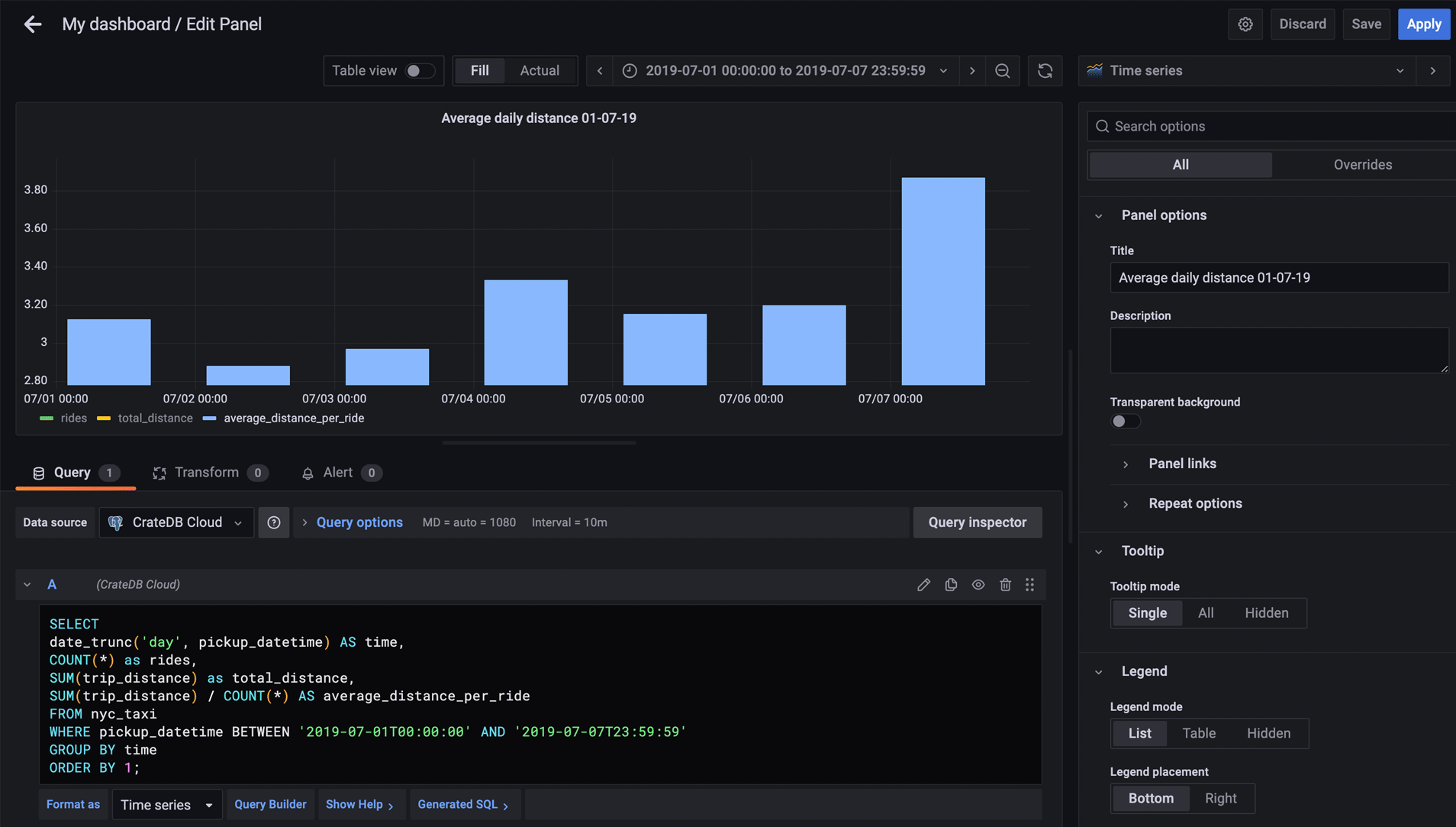
Another question worth asking might be: What was the average distance per ride per day? To find this out, input the following SQL statement into the console of the new panel:
SELECT
date_trunc('day', pickup_datetime) AS time,
COUNT(*) as rides,
SUM(trip_distance) as total_distance,
SUM(trip_distance) / COUNT(*) AS average_distance_per_ride
FROM nyc_taxi
WHERE pickup_datetime BETWEEN '2019-07-01T00:00:00' AND '2019-07-07T23:59:59'
GROUP BY time
ORDER BY 1;
Under the graph itself, click on the average_distance_per_ride. This will show only the value we are interested in. Also, in the right menu under “Graph style” select “Bars” once again. After that, you should have a panel similar to this:
When you’re happy with the panel, click Apply. Now, when brought back to the Dashboard overview, you will have a collection of two very useful graphs.
Now you know how to get started with data visualization in Grafana. To find out more, refer to the Grafana documentation.