Apache Superset is an easy-to-use open-source business intelligence (BI) application that offers a rich set of customizable data visualizations. With Superset, you can explore, filter, and organize your data. You can also create and share custom monitoring and analytics dashboards.
CrateDB is a distributed SQL database that makes it simple to capture, store, and analyze massive amounts of operational data in real-time.
In this post, I'll show you how to get started with CrateDB and Apache Superset. And by the end of this post, you should have your very first Superset visualizations running on top of CrateDB data.
Note: The following instructions are done on macOS, and should be easily adaptable for Linux. It uses CrateDB 4.6.6 and Apache Superset 1.3.2.
Setup CrateDB
Get CrateDB set up with a single command:
bash -c "$(curl -L https://try.crate.io/)" This command downloads CrateDB and runs it from the tarball. If you'd like to install CrateDB permanently, or you are using Windows, check out our collection of one-step install guides.
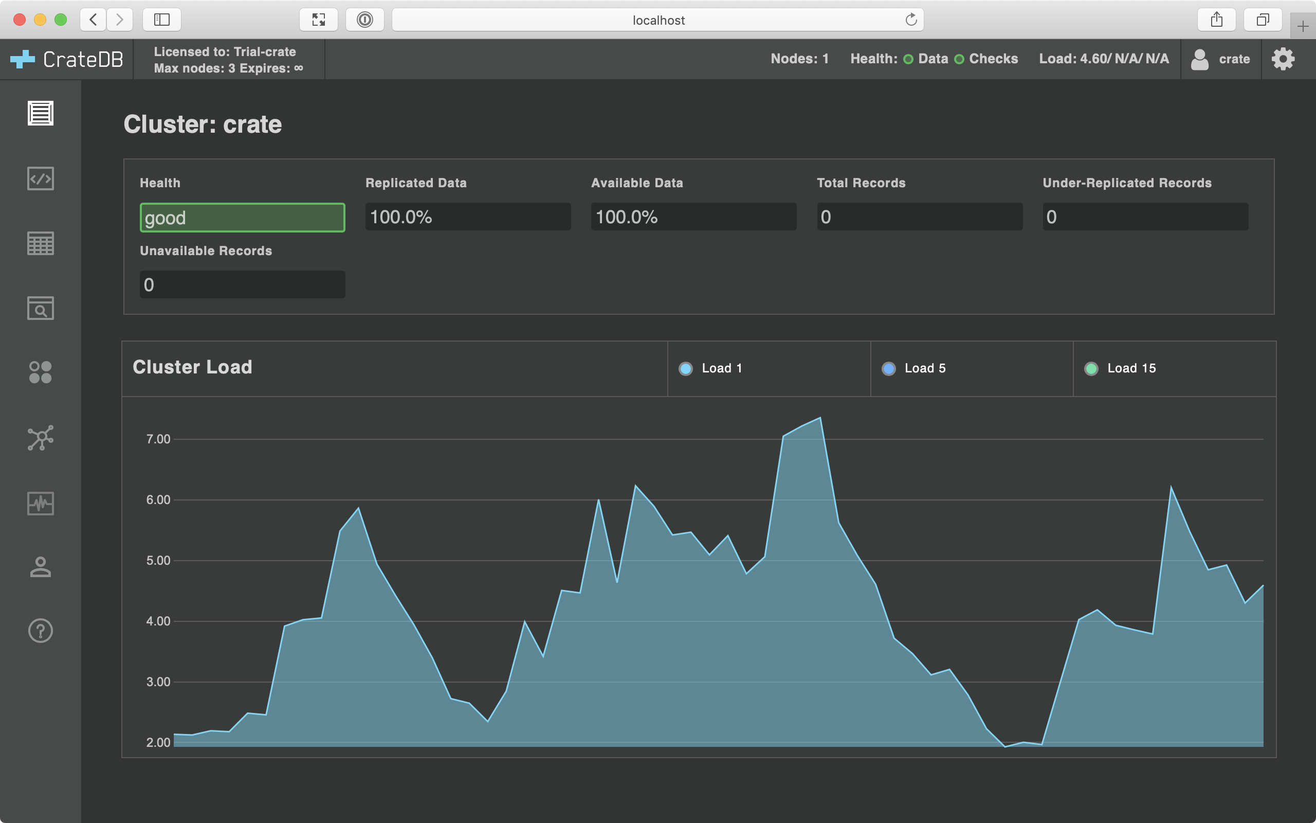
If you're using the command above, it should pop open the CrateDB admin UI for you automatically once it has finished. Otherwise, head over to http://localhost:4200/ in your browser.
You should see CrateDB Admin UI as illustrated below:
Get Data
As the fresh CrateDB installation does not have any data, we are going to import some of the existing datasets. We choose to import the Twitter sentiment corpus that consists of more than 5,000 tweets classified concerning one of four different topics. The full corpus of data can be found here.
Before data import, we need to create a new table in CrateDB with the following schema:
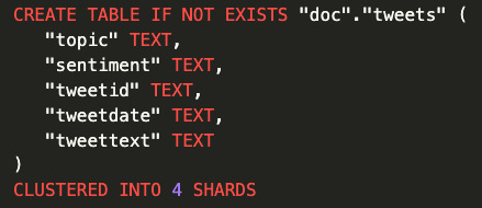
Finally, we import Twitter sentiment corpus with COPY FROM statement that copies data from a file into a table:
COPY doc.tweets FROM 'file:///path_to_file/full-corpus.csv' RETURN SUMMARY;
Once the data is imported, select the Tables icon from the left-hand navigation in Admin UI, and then select the tweets table. You should end up here:
http://localhost:4200/#/tables/doc/tweets
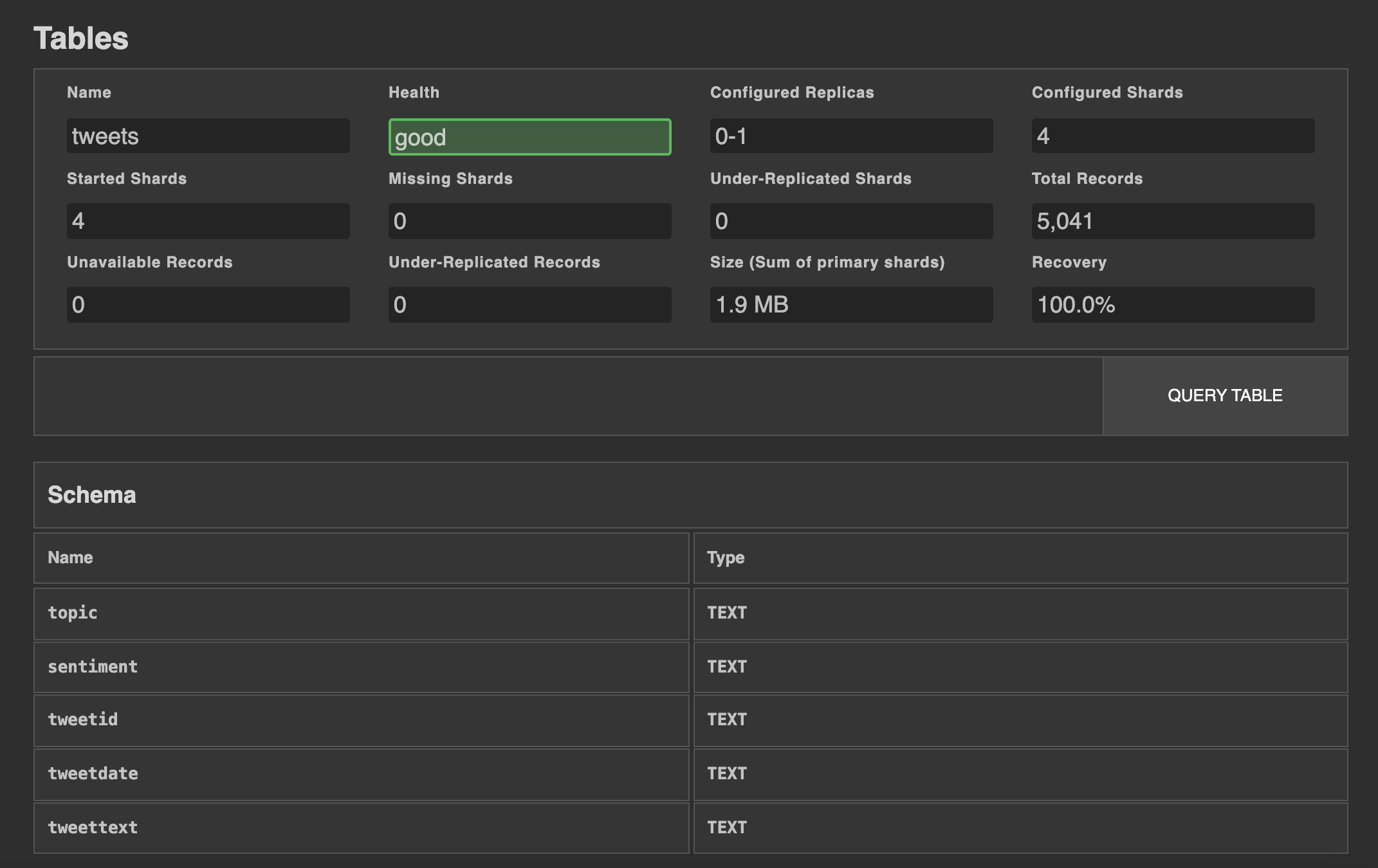
To inspect some of the data samples, click on the Query Table button. The output of the SELECT statement should look as follows:
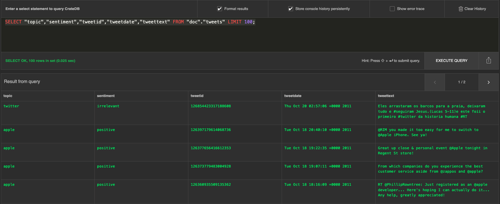
Great! At this point, the CrateDB is up and running with data that can be further analyzed.
In this article, we will show you how to graph a pie chart to illustrate the numerical proportion of tweets per different topic and how to visualize sentiment data for each topic in a bar graph.
Install Apache Superset
The fastest way to set up Apache Superset is to use Docker and Docker Compose on a Linux or macOS computer. In this article, we will show how to install and use Apache Superset on macOS, and to find out how to use it with other operating systems please follow the official documentation. Before continuing, make sure that you have installed Docker for Mac.
The first step is to clone Superset’s repository with the following command:
git clone https://github.com/apache/superset.git
After the superset directory has been downloaded, we need to extend the list of requirements with a Python database driver for CrateDB. To do this, create the requirements-local.txt file and add a new line to it:
echo "sqlalchemy-cratedb" >> ./docker/requirements-local.txt
Now, run the docker-compose command from the superset directory:
docker-compose -f docker-compose-non-dev.yml up
The command will spin several docker containers. After the logging output from the containers slows, you can start exploring Apache Superset on your local machine.
Run Superset
To access Superset, visit http://localhost:8088 in your browser:

Log in with the default username and password:
- username: admin
- password: admin
Afterward, you should see the starting page of Apache Superset:
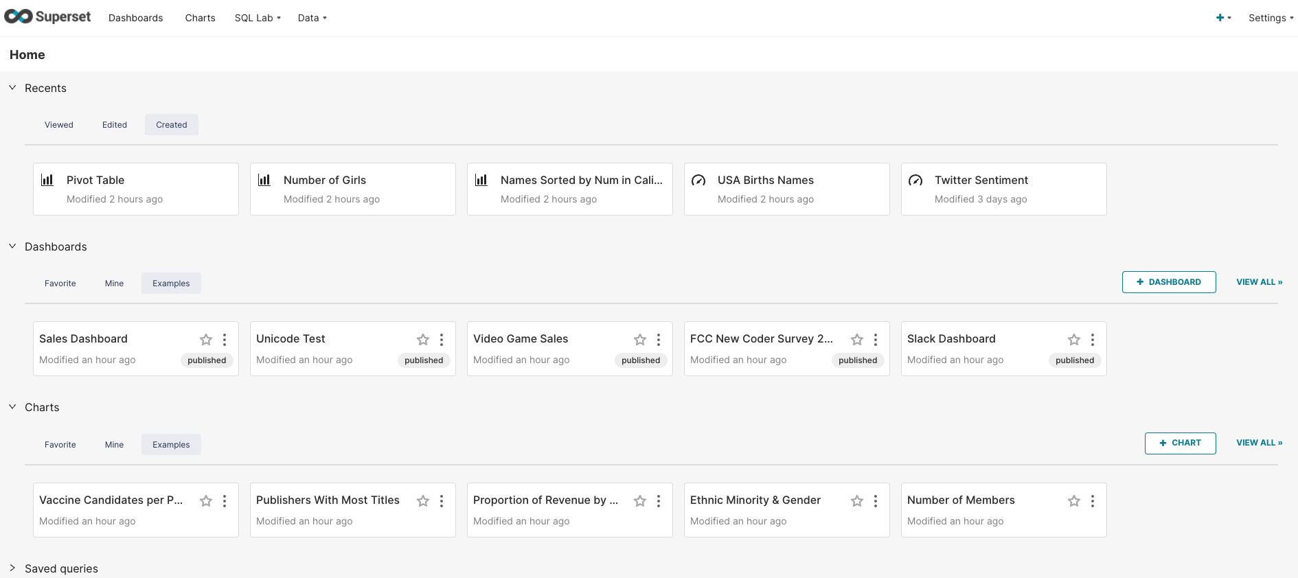
The Superset app Docker container also loads several datasets and dashboards that can be used as a starting point for learning different visualization options.
Connect to CrateDB
To connect Apache Superset with CrateDB select Data → Databases from the top navigation menu:
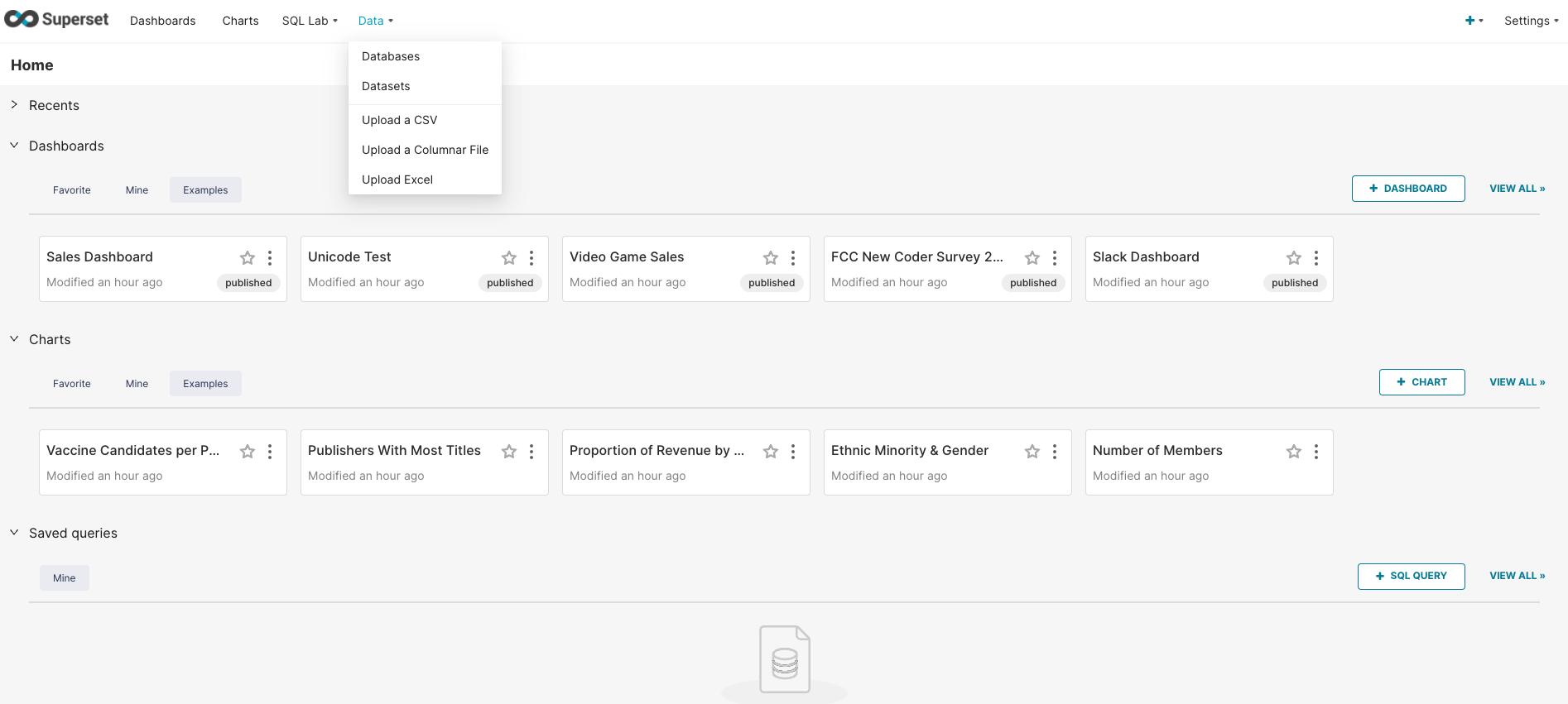
Click on the Database button in the top right-hand corner of the screen. This will open a new window for choosing a database to connect to. Among the list of databases choose CrateDB.
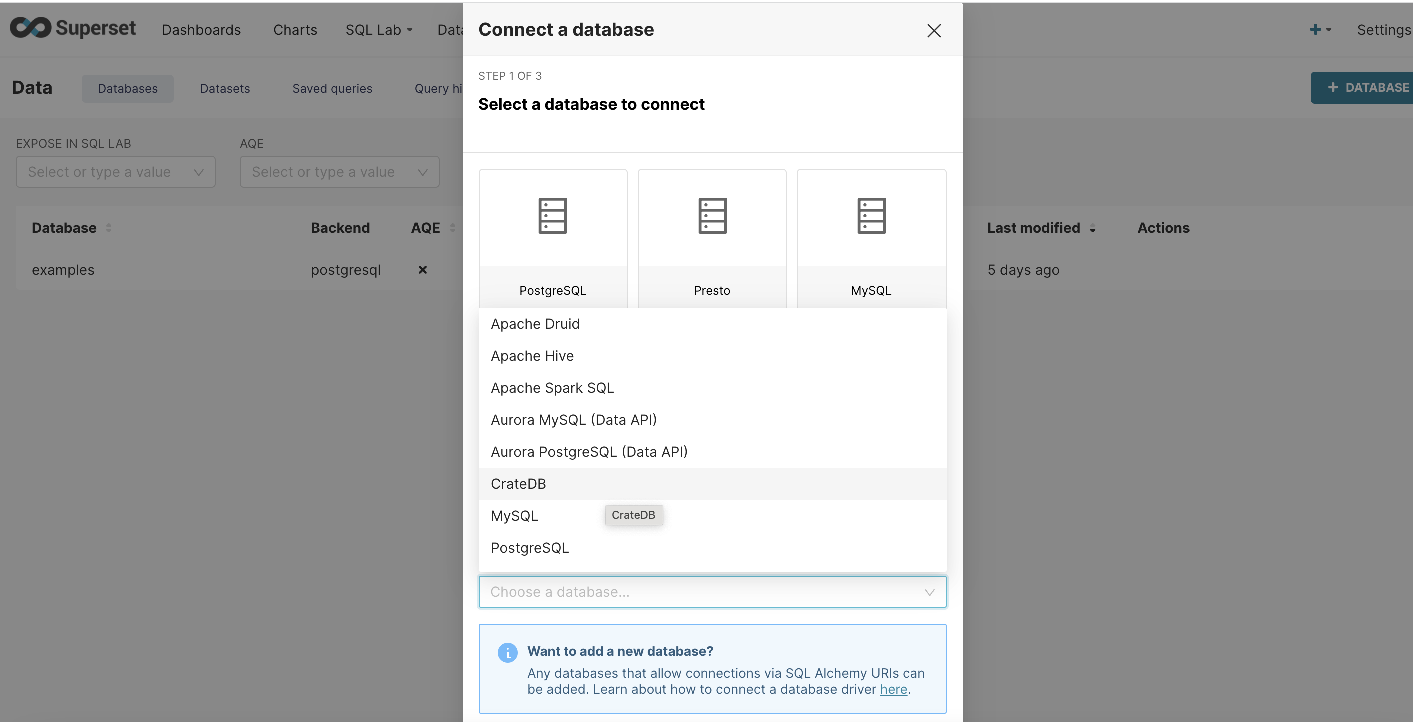
In the same form, fill out the following information:
-
Database:
CrateDB -
SQLAlchemy URI:
crate://crate@host.docker.internal:4200
Like so:
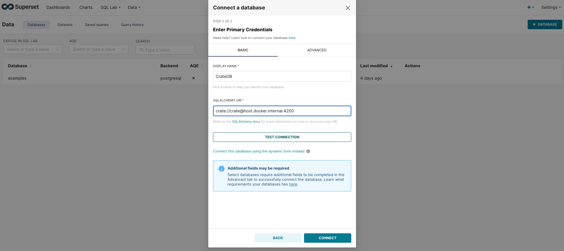
Then, click the Test Connection button. You should be presented with a modal popup window saying "Connection looks good!". To finally connect, click Connect button.
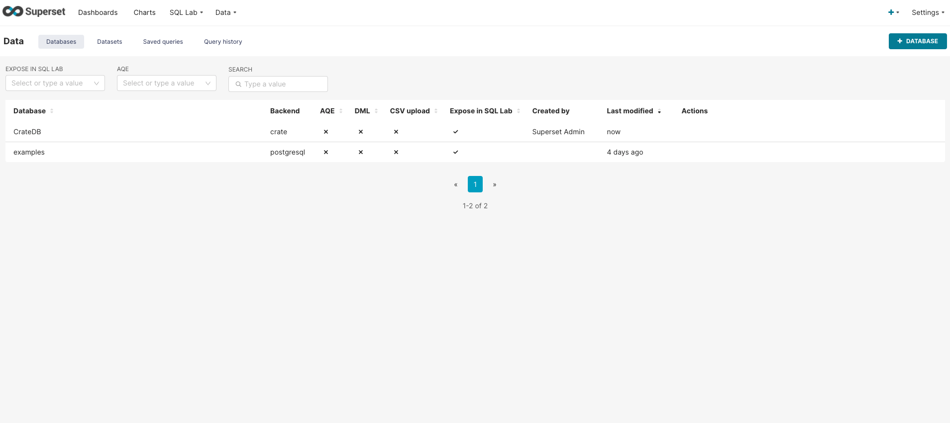
CrateDB database connection will appear in the list of databases:
The next step is to import a new dataset: go to Data → Dataset from the top navigation menu and click on the Dataset button in the top right corner.
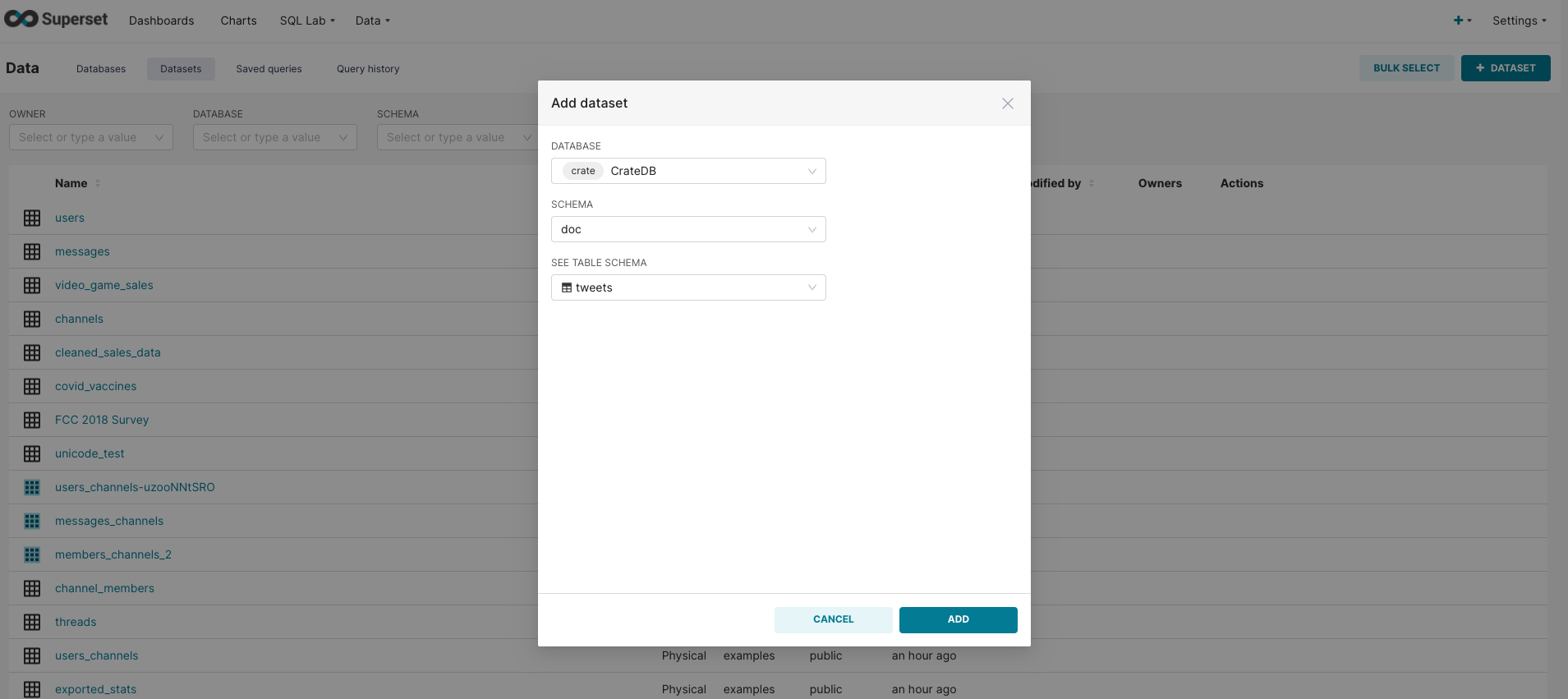
To add data from the tweets table, select the following:
-
Database: CrateDB
-
Schema: doc
-
Table Schema: tweets
Click Add button and the data will appear in the list of data sources.
Create Dashboard
Before creating individual charts, let’s first create a new dashboard that will be used to display charts together. This can be done by choosing Dashboards from the navigation bar and clicking on the Dashboard button in the top right corner. This will open the following window:
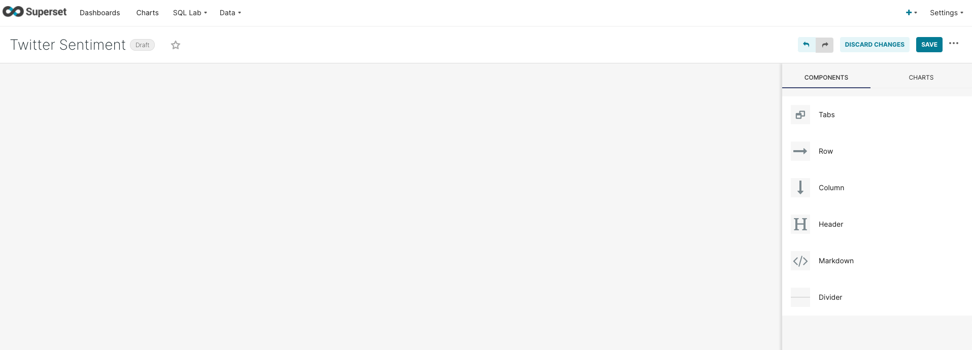
Name the dashboard Twitter Sentiment as illustrated and click on the Save button.
Create a Pie Chart
The first chart we are going to create is a pie chart. Choose Charts from the navigation menu and click on the Chart button in the top right corner. This opens a new window for choosing Chart type as illustrated below.
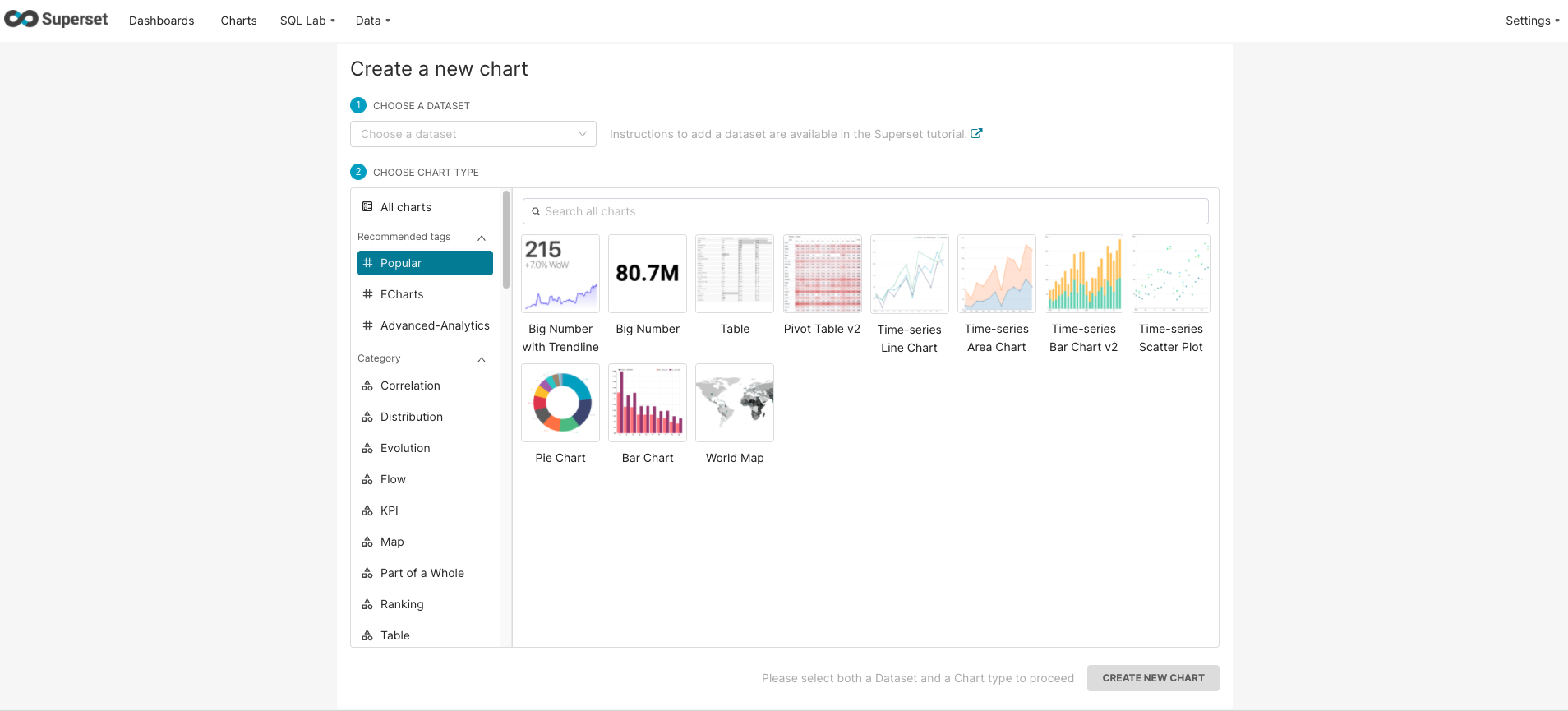
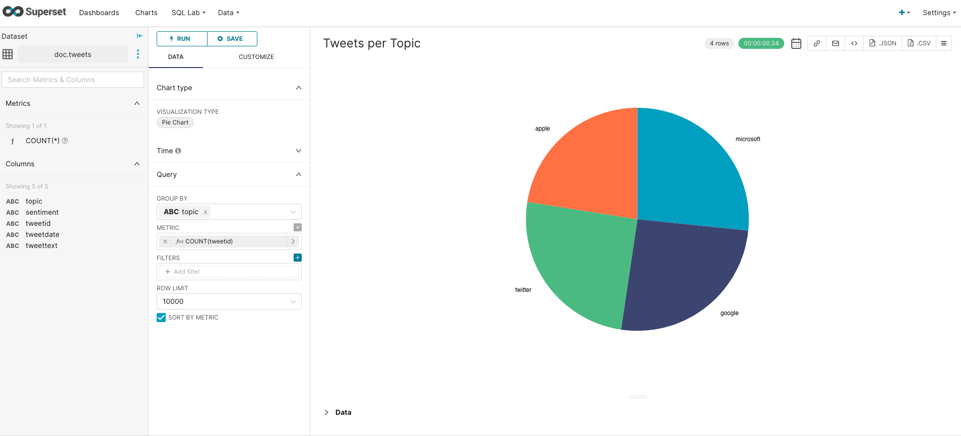
As a dataset choose tweets, as a chart type choose pie chart, and then click on Create New Chart. The window opens a form for specifying the query that extracts data to be visualized. The query can be specified either graphically or in the SQL format. For example, if we want to show proportions of tweets per topic, we will specify the query like the following:
-
First, we need to group tweets by the topic
-
Second, we specify the metric we want to show: in our case, it is the number of tweets. The corresponding
SQLmetric is defined asCOUNT(tweetid) -
Finally, we leave the filter empty as we want to take into account all tweets
The resulting chart shows the proportion of each topic to the total number of tweets. Click on the Save button above the query form, choose the chart name and add to the Twitter Sentiment dashboard as follows:
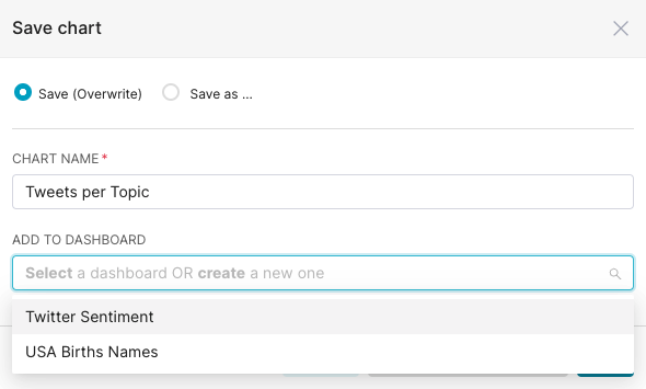
Now if you open the Twitter Sentiment dashboard, the created pie chart will show up.
Create a Barchart
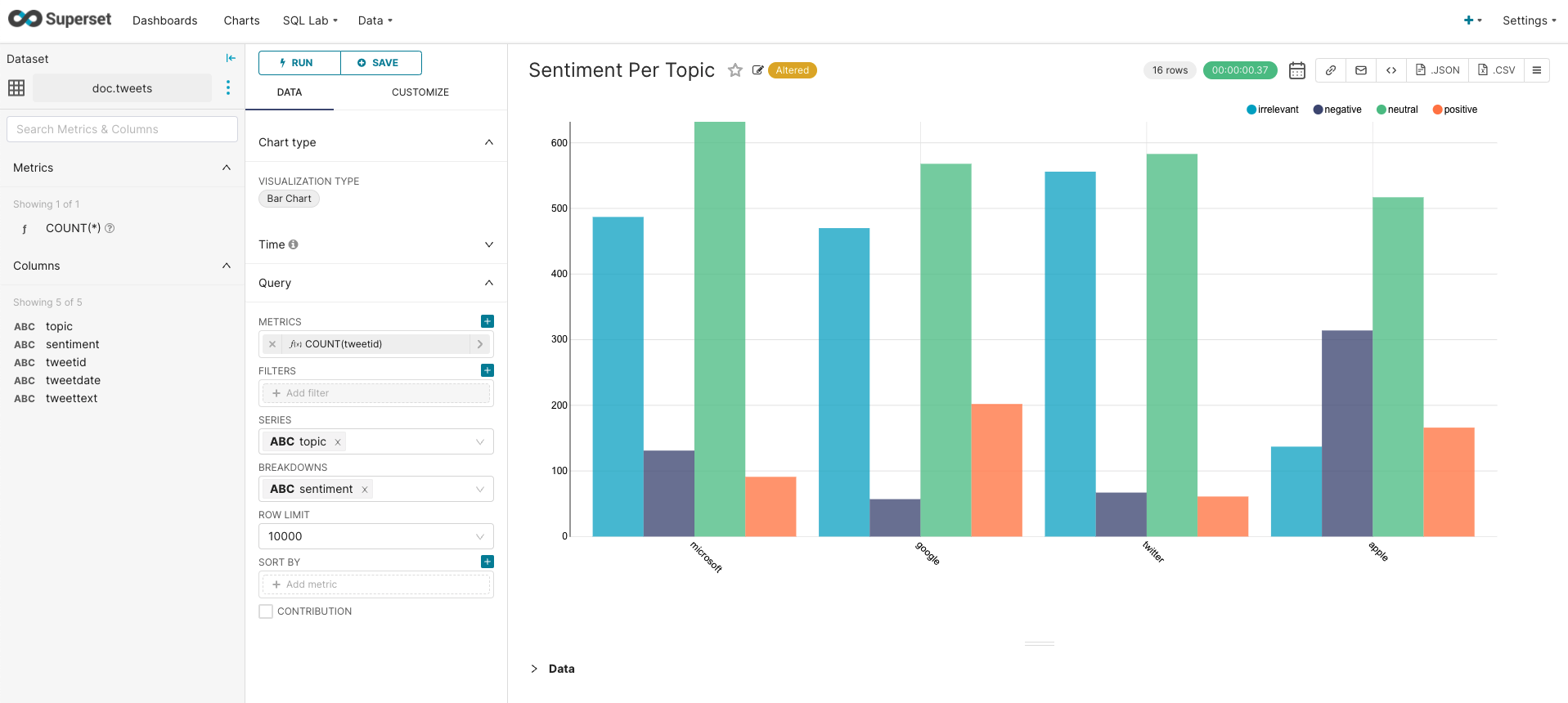
Now, let’s illustrate the sentiment per topic. This time, we choose a bar chart with the query as illustrated below:
-
We choose the number of tweets as a metric, e.g.,
COUNT(tweetid) -
Then, we group data by topic (series = topic).
-
Finally, we break each group by sentiment, to show for each topic how many tweets are classified as positive, negative, neutral, and irrelevant (breakdowns = sentiment)
Next, save the graph to the Twitter Sentiment dashboard. The dashboard now contains two charts as shown below:
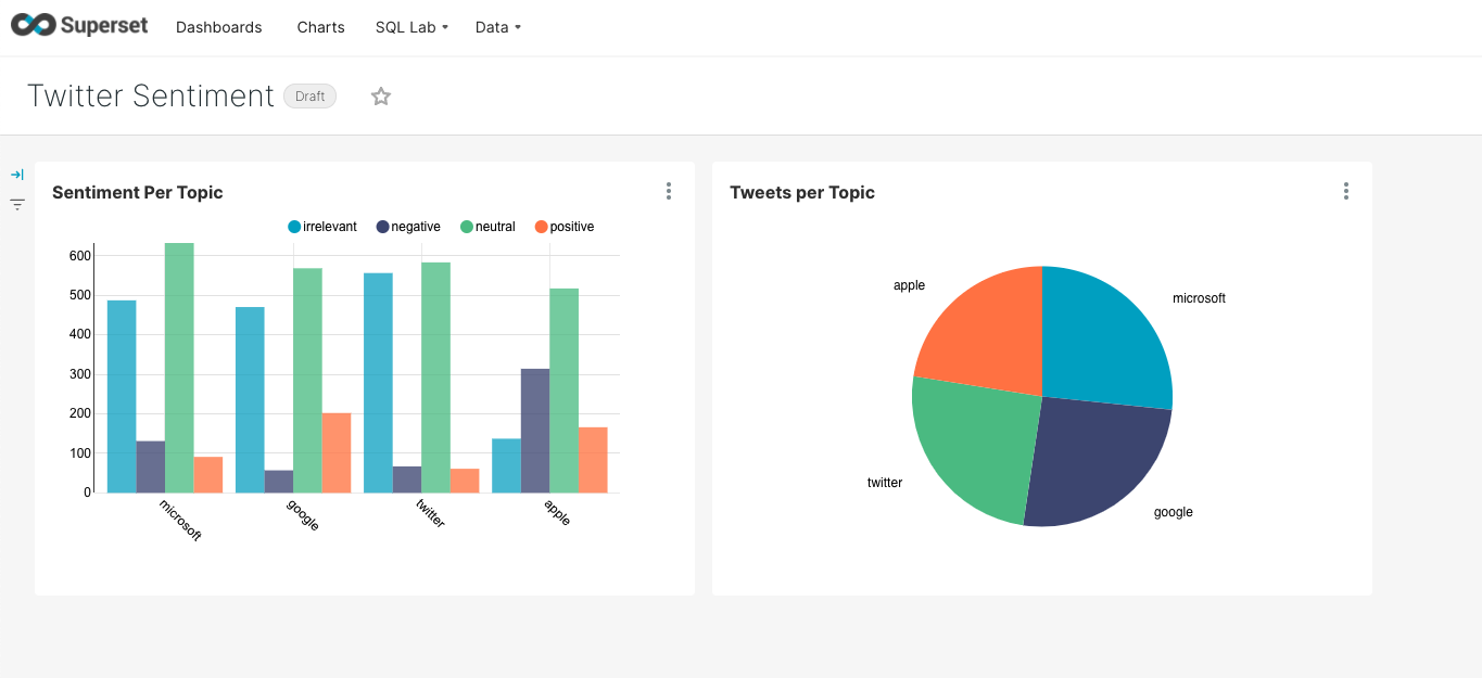
For our dataset, we can observe that Google has the highest number of positive tweets and the lowest number of negative tweets. On the other hand, about Apple, there are more negative tweets than for other topics. Interestingly, most of the tweets for all topics are classified as neutral.
Wrap Up
Apache Superset is an open-source cloud-native application that allows easy visualization of massive amounts of data. CrateDB is a distributed SQL database that makes data storage and analysis simple and at scale. Together, they provide a powerful open-source platform for data warehousing and business intelligence.
This post illustrated how to make the first start with CrateDB and Apache Superset, specifically:
-
How to get CrateDB up-and-running
-
Importing interesting data from a filesystem
-
How to install Apache Superset via
docker-compose -
Setting up a connection to CrateDB
-
Creation of a dashboard and two different types of charts
Questions? Looking for help? Get in touch!
