Exploratory Data Analysis (EDA) is a vital step in the data science process. It involves analyzing datasets through various statistical methods and visualizations, with the goal of understanding the primary characteristics of the data.
EDA is not merely about calculations or plotting graphs; it's a comprehensive process of 'acquainting' ourselves with the data. This involves seeking patterns and trends that provide insights into relationships between variables and understanding the dataset's underlying structure. Identifying deviations from expected trends is crucial. These could signal anomalies or outliers, indicating potential errors or noteworthy events that require further investigation. Alongside numerical analysis, visualization plays a critical role in EDA. Graphs and plots make complex data more accessible and easier to comprehend.
Practical Application of Exploratory Analysis with PyCaret and CrateDB
PyCaret distinguishes itself with a low-code approach, offering an efficient machine learning pipeline that is both user-friendly for beginners and sufficiently robust for expert users. When combined with CrateDB, it forms a powerful pair for managing large-scale data analytics and machine learning projects. CrateDB excels at handling large volumes of data in real-time, while PyCaret leverages its machine learning algorithms to perform a variety of analytics tasks on this data.
The following steps guide you through the process of data extraction from CrateDB, preprocessing with PyCaret, and data visualization to understand the distributions and relationships within the data.
# Define the connection string to running CrateDB instance.
CONNECTION_STRING = os.environ.get(
    "CRATEDB_CONNECTION_STRING",
    "crate://crate@localhost/",
)

# Connect to CrateDB Cloud.
# CONNECTION_STRING = os.environ.get(
#     "CRATEDB_CONNECTION_STRING",
#     "crate://username:password@hostname/?ssl=true&schema=notebook",
# )

engine = sa.create_engine(CONNECTION_STRING, echo=os.environ.get('DEBUG'))
After defining the connection string, we load sample data into a weather_data table and fetch data into a pandas DataFrame.
from cratedb_toolkit.datasets import load_dataset
dataset = load_dataset("tutorial/weather-basic")
dataset.dbtable(dburi=CONNECTION_STRING, table="weather_data").load()
query = "SELECT * FROM weather_data"
with engine.connect() as conn:
    result = conn.execute(sa.text(query))
    columns = result.keys() # Extract column names
    df = pd.DataFrame(result.fetchall(), columns=columns)
df.head(5)
In the dataset, the 'timestamp' column is a key to time-based analysis. We convert this column into a datetime object using pandas' to_datetime function. This column is also set as the index of our DataFrame, enabling us to resample data based on periods and compute rolling statistics.
df['timestamp'] = pd.to_datetime(df['timestamp'], unit='ms')
df.set_index('timestamp', inplace=True)
df.head()
We use time-weighted interpolation to estimate missing values in the 'temperature', 'humidity', and 'wind_speed' columns. By specifying the method as 'time', we calculate the estimated values for missing data points based on the linear time difference between known points.
df['temperature'] = df['temperature'].interpolate(method='time')
df['humidity'] = df['humidity'].interpolate(method='time')
df['wind_speed'] = df['wind_speed'].interpolate(method='time')
df.fillna(method='bfill', inplace=True)
df.head()
Before analysis, we perform a final preprocessing step. We extract data for a specific city, calculate daily averages, and organize the DataFrame with a timestamp index for further analysis or visualization.
df_berlin = df[(df['location']=='Berlin')]

# Ensure the index is in datetime format for resampling
df_berlin.index = pd.to_datetime(df_berlin.index)

# Now aggregate to daily averages
df_berlin_daily_avg = df_berlin.resample('D').mean()
df_berlin_daily_avg.reset_index(inplace=True)

# Ensure 'timestamp' column is set as index if it's not already
df_berlin_daily_avg.set_index('timestamp', inplace=True)
df_berlin_daily_avg.head(5)
We initialize our forecasting environment using PyCaret, defining the forecast_horizon as 10 and fold as 3 for a 3-fold cross-validation process. We pass the target variable, 'temperature', and a list of seasonal periods to the TSForecastingExperiment object, which serves as a primary tool for time series analysis.
forecast_horizon = 10
fold = 3

eda = TSForecastingExperiment()
eda.setup(data=df_berlin_daily_avg, fh=forecast_horizon, target='temperature', seasonal_period= [1, 5, 20])
import plotly

# Plotly plots will be rendered as PNG images, uncomment the following line to crate an interactive chart
plotly.io.renderers.default = 'png'

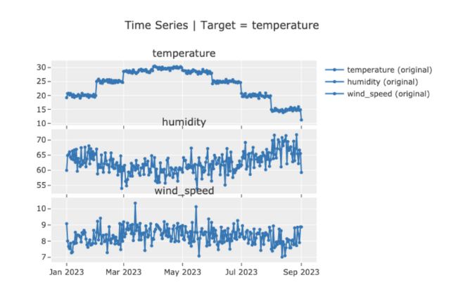
eda.plot_model()

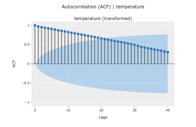
eda.plot_model(plot="acf")

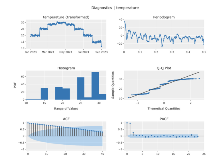
eda.plot_model(plot="diagnostics", fig_kwargs={"height": 800, "width": 1000})

With this overview, you are equipped to perform your EDA on time series data, leverage the integrations between PyCaret and CrateDB, and be on your way to drawing insightful forecasts from your datasets.
