Visualizing time series data is crucial for understanding patterns and trends. Grafana, the open source analytics and monitoring solution, offers a robust platform for creating and sharing dashboards. When paired with CrateDB's strong handling of time series data, Grafana enables dynamic visualizations, making data analysis and interpretation simpler.
Connecting to CrateDB from Grafana
-
- Open Grafana and navigate to Connections, then 'Data Sources’;
- View the list of all data sources. Establish a connection to CrateDB via the PostgreSQL wire protocol;
- Input the connection details including the Host URL, Database name, Username, and Password. Note that these parameters vary based on whether you are connecting to a CrateDB Cloud or local instance;
- For a CrateDB Cloud cluster, set the TLS/SSL Mode to ‘verify-full’;
- Validate the connection to ensure Grafana and CrateDB can communicate and then save the connection configuration.
Overview of Grafana Dashboards and Queries
With the connection established, let's explore an example dashboard and its associated queries.
Weather Data Dashboard
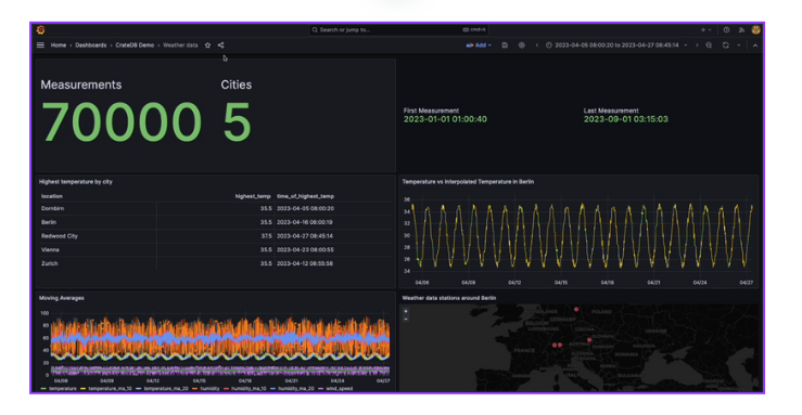
The sample dashboard for weather data below provides information on the number of entries in the dataset, the cities covered, and the time frame of the measurements. The queries generating this information can be viewed by inspecting and navigating to the query tab.

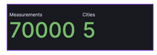
In the first panel, we display the number of measurements as a count of all timestamps and the number of cities as a count of distinct locations:

The dashboard's table reveals the highest recorded temperature for each location and the corresponding time. This data is generated by a query using the MAX aggregation function to find the highest temperature and the MAX_BY function to find the timestamp of this value. The results are grouped by location.


Dealing with Missing Values
The graph adjacent to the table compares the interpolated temperature to real values, addressing a common problem in time-series data: missing values. These can occur due to sensor malfunctions or disconnections. To handle this, CrateDB employs window functions paired with the IGNORE NULLS feature, allowing us to spot the next and prior non-null temperature recordings, and compute the arithmetic mean to bridge the gap.


Rolling Averages
The graph at the bottom left displays moving averages, a crucial tool in time-series analysis. They smooth out short-term fluctuations and reveal underlying trends by averaging data points over a set period. The queries for computing these averages are accessible in the query window.

Geospatial Data
The final piece of the dashboard demonstrates CrateDB's efficient querying of geospatial data. It presents a map showing all weather stations within a 1000km radius from Berlin.

This data is produced by a query that uses scalar functions in CrateDB to obtain latitude and longitude information from each point and a distance function to filter the points.

Now that you have this fundamental knowledge of visualizing time series data using Grafana and CrateDB, you will be able to efficiently query, visualize, and further analyze your time series data.
